Faster, more understandable navigation coming to your Tettra account soon
timestamp1548963300001

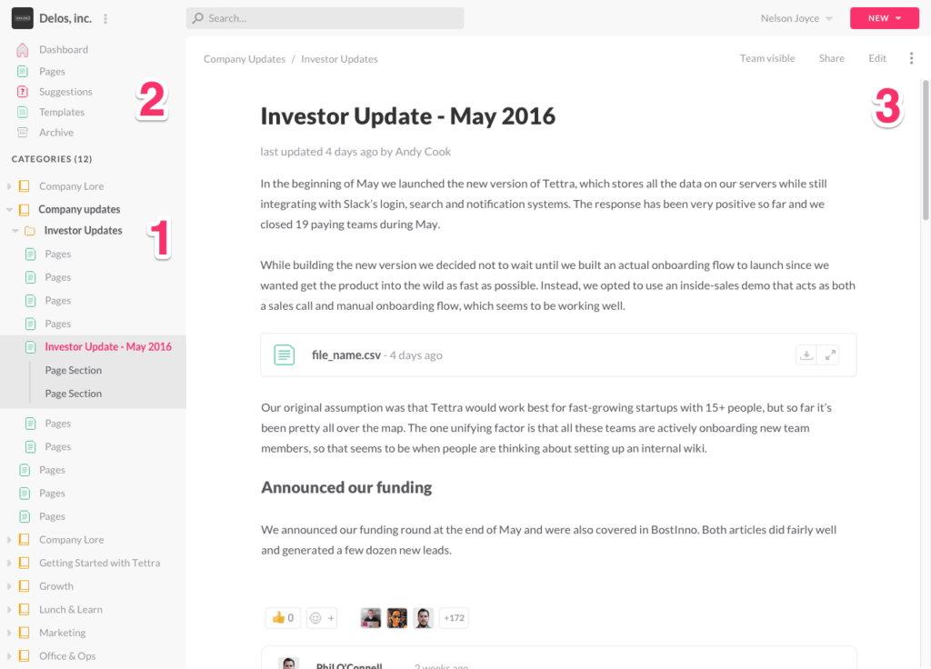
Next week when you log into your Tettra account, you’ll notice some changes to the app navigation. We hope you’ll find that moving around your account with this new nav will be much quicker. We also think it will be easier for new Tettra users to find their way around the app and learn what they can do with Tettra.
We know it can be frustrating to have the tools you use every day change suddenly, so I wanted to take some time to give you a heads up and let you know why we’re doing it. I think you’ll like what you see.
Why make the change?
There are a few problems with our current app navigation that we can fix to improve the overall quality of the app. Quality is a big goal for us, so I think it’s worth making these changes for the following reasons.
Speed
Many of the actions in the app take multiple page loads to accomplish. For example, navigating from one page to another page in a different category takes 2-3 page loads. This isn’t necessarily a bad thing, but due to some page load speed challenges, it can feel really clunky. We think making more of the app accessible from anywhere will help alleviate some of that clunkiness.
“Modern” feel
When we did the current app designs for Tettra, we were one of the first modern knowledge management apps, so it was more of a green field. In the 2 years since then, expectations around what an app like ours should look and feel like have evolved a lot. I think we can make changes to be more in line with what a “modern” wiki feels like.
Findability/learnability
Right now the newest and most useful functionality of Tettra is hard to find (suggestions, templates, etc.). We want to help new users see what the app can do by putting all the different objects front and center.
Here’s what’s changing next week

In this new design you’ll see:
- The ability to navigate from any part of the app from any other part with a persistent sidebar nav
- The most useful features of Tettra like page suggestions, drafts, and templates are more easily accessible
- Consistently visible page controls as you’re scrolling through page content
We’re going to continue to improve this new navigation over time, including an updated dashboard view and more investments in app speed. Keep an eye out for these changes later next week. We hope you’ll like the changes. Let us know if there’s anything we can help you with in the meantime.
