Tettra Editor Updates: Work Smarter with Code Blocks and Callout Boxes
timestamp1539954420001
We’re releasing two updates to the Tettra editor, both of which originated from input from the amazing 31,000 humans who engage with our product. These include callout boxes to draw attention to important info and language selection for code blocks. Both updates aim for a better writing experience for the person doing the documentation and a better reading experience for others on the team.
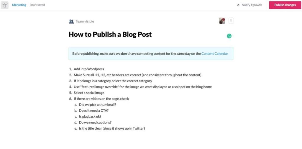
Callout Boxes
Some of our teams report wanting to elevate the importance of specific content. This might come up when you need to grab people’s attention on a Tettra page before viewers engage with the content or at the end of the page when you give guidance on next steps. Perhaps you want to let people know that it’s a work in progress or dissuade them from making edits. Maybe you want to set the overarching context.

With callout boxes, you can grab the viewer’s attention anywhere on the page. We opted for a color (light blue) that didn’t have pre-defined associations. Red, for example, signals caution, while green often signals something that’s been approved or defined as good. The neutrality of light blue allows for more flexibility, so that callout boxes can be used in a myriad of ways. The person writing the documentation decides what “tone” to set in the callout box, based on the content written inside.
You can access callouts from the insert menu on any Tettra page.

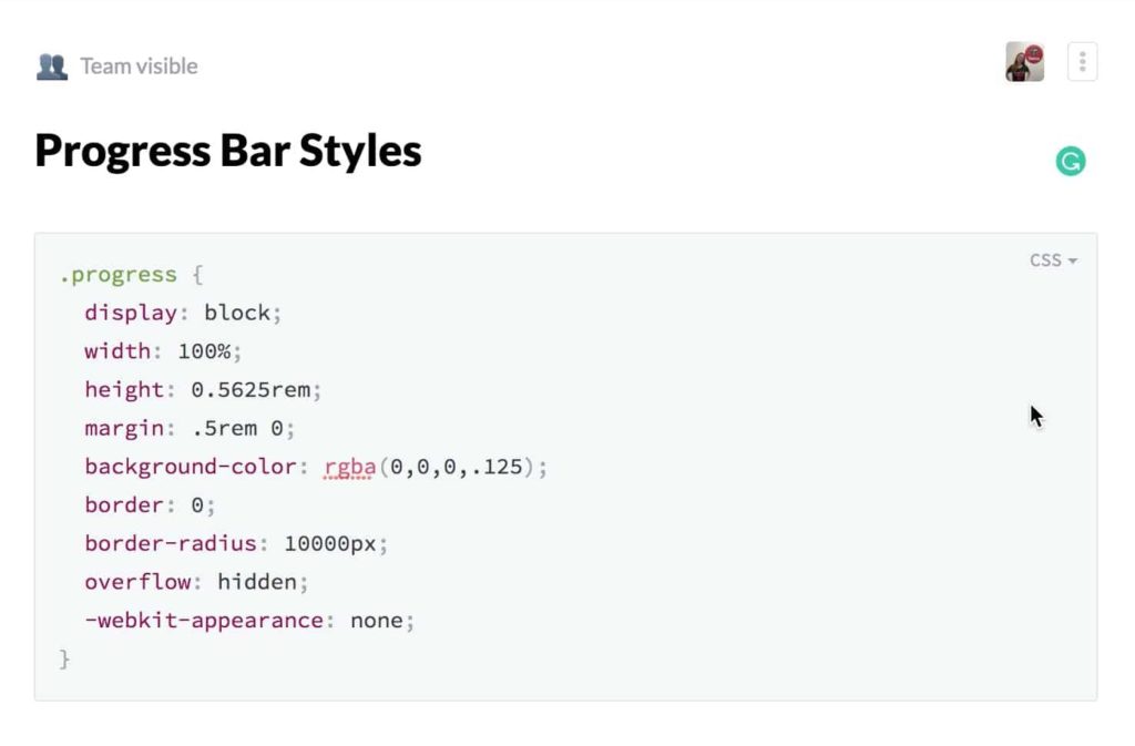
Code Block Language Selection
Given our strong foothold among tech teams, engineers, and product leaders, it’s no surprise that people share code blocks in Tettra. This kind of knowledge transfer makes it easier for tech teams to repurpose code or simply convey how they approached a problem.

Our CTO, Shauni, points out that this helps her in multiple ways. Not only can she share code with others; she’s also documenting examples for her future self. These reference points allow everyone to be more efficient.
Ideally, code blocks reflect the same formatting you’re used to. This makes it easier to read and digest what you’re seeing. But this necessitates the ability to select your language when sharing code snippets, an option we previously lacked. Now, when you open a code block, you can select your language. The formatting for a given code snippet now aligns with how teams are accustomed to seeing them.
Balancing Simplicity and Utility
We’re bullish on simplicity here at Tettra. In fact, it’s why many people embrace our product so readily. ‘Too much complexity’ is one of the biggest reasons people cite for abandoning other wikis and turning to Tettra. After all, if a knowledge database is overly complex, people feel daunted about contributing all that great expertise they carry around in their heads. Therefore, we try to maintain a simple, intuitive experience whenever possible.
On the other hand, we also want to ensure we’re building and supporting the features that make a team successful. Our product can’t be so stripped down that people lack the functionality they need. We’re always striving to find the proper balance, keeping the Pareto Principle in mind.
Both of these changes seek to strike this balance. Callout boxes, for example, serve as a middle ground. They’re a halfway point between having everything look the same and having pages that look like circus acts, filled with a million different fonts and colors. As we continue to expand the functionality of our product, we’ll always try to start from a point of simplicity and then judiciously select areas where we need to build in more utility.
We love rolling out product improvements that originated from customer feedback. Please continue sharing ideas for how we can make Tettra an even more powerful tool for team cooperation.
