Our latest Tettra update will make your life just a bit simpler
1483232880001
Today we’re launching a brand new design for creating, reading, and navigating Tettra pages. It’s the best version of Tettra we’ve shipped to date.
Our interface is the window to the value we provide you, so we work every day to make it simpler and easier to use. Every rough edge or confusing moment takes away from that value we provide.
We want you to spend as little time as possible clicking, swiping, and navigating the tool and as much time as possible getting value from it.
Here’s an overview of the changes:
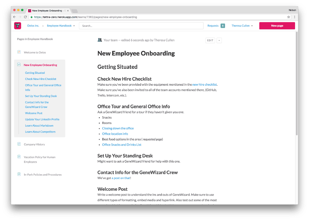
New page view and navigation
The new page view is drastically simplified so that the page content is front and center. We’ve tucked a lot of the extraneous information away to make the layout less busy.
There’s also a brand new navigation bar across the app. We noticed that it could be cumbersome to navigate between different categories, so we added a dropdown to quickly get from category to category.

New editing options
Another big change is to the publishing options. We made it simpler to publish edits and new pages by moving the “Publish changes” button out of the “Publishing Options” and into the navigation.
The old publishing options are now included as dropdowns in the navigation.
We hope you love this new design.
p.s. We’re on Product Hunt today!